Beginning Plotting: Difference between revisions
From KitwarePublic
Jump to navigationJump to search
No edit summary |
No edit summary |
||
| Line 55: | Line 55: | ||
==Plot data== | ==Plot data== | ||
*'''Edit''' → '''Reset Session'''. | |||
*Open can.exo. Turn on all data. '''Apply'''. | |||
*Drag the can around with the left mouse button until you can see the can. | |||
*We want to plot two variables against each other, for all points (or cells) of the can. | |||
*'''Filters→Data Analysis→Plot Data'''. Apply. | |||
*On the Properties tab, turn off '''Use Index for X Array''' and for X Array Name select '''DISPL_Z''' | |||
*In Series Paramaters, turn off everything except '''DISPL (Magnitude)''' | |||
*Play | |||
[[Image:beginning_plotting_5.png|1000px]] | |||
=Acknowledgements= | =Acknowledgements= | ||
Sandia is a multiprogram laboratory operated by Sandia Corporation, a Lockheed Martin Company, for the United States Department of Energy’s National Nuclear Security Administration under contract DE-AC04-94AL85000. | Sandia is a multiprogram laboratory operated by Sandia Corporation, a Lockheed Martin Company, for the United States Department of Energy’s National Nuclear Security Administration under contract DE-AC04-94AL85000. | ||
Revision as of 02:25, 24 December 2015
Introduction
This use case shows a user how to plot cell and point data. Plotting can be along a line that cuts through your data, or a location with respect to time.
Plot along a line
- Open can.exo. Turn on all data. Apply.
- Drag the can around with the left mouse button until you can see the can.
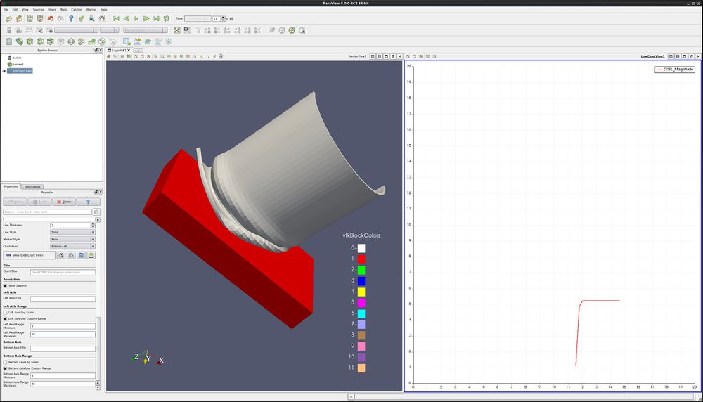
- Filter→Data Analysis→Plot Over Line. Drag the top of the line to intersect the top of the can. Note that hitting the p key will also place the line on the surface of your object. Apply.
- Properties tab. Unselect all variables except DISPL:Magnitude.
- Lower on the Properties tab, find Left Axis Use Custom Range. Select this, and enter 0.0 and 20.0.
- Find Bottom Axis Use Custom Range. Select this, and enter 0.0 and 20.0.
- Play the animation forward, and notice what happens to the plot.
- You can also add plot labels and axis labels on the properties tab.
Plot point over time
- Edit → Reset Session.
- Open can.exo. Turn on all data. Apply.
- Drag the can around with the left mouse button until you can see the can.
- We want to plot a point over time. First, we need to select a point.
- Click on Select Points On icon. Then, click on a point on the can.
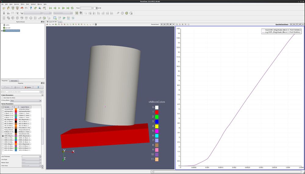
- Filters→Data Analysis→Plot Point Over Time. Apply.
- Display tab, unselect everything other than DISPL (Magnitude)
- You now have a plot of the displacement. at your point.
- Extra Credit – Using Select Cells On icon, and the Plot Cell Over Time, plot EQPS over time.
Plot two variables at same time
- Follow the steps for Plot Point over time, as described above.
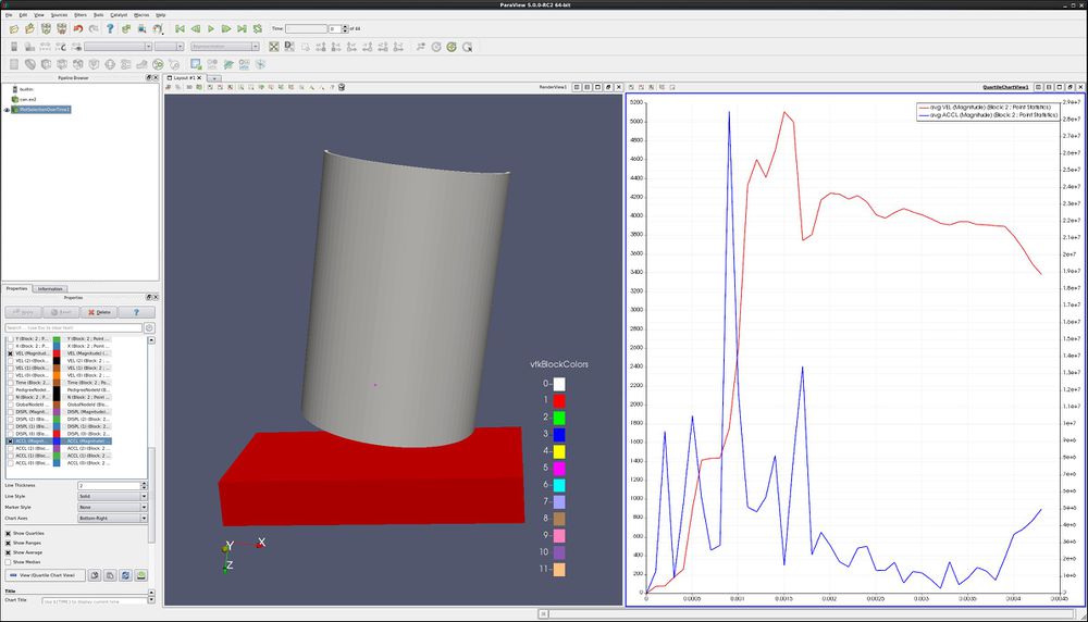
- On the Properties tab, turn off DISPL (Magnitude) and turn on variables VEL (Magnitude) and ACCL (Magnitude).
- Select the line that says ACCL (Magnitude), causing this row to turn gray.
- At the bottom of the Display tab, change Chart Axes to Bottom-Right.
- Note below that the ACCL (Magnitude) color has been changed to blue.
Plot multiple points
- Edit → Reset Session.
- Open can.exo. Turn on all data. Apply.
- Drag the can around with the left mouse button until you can see the can.
- We want to plot numerous points over time. First, we need to select the points.
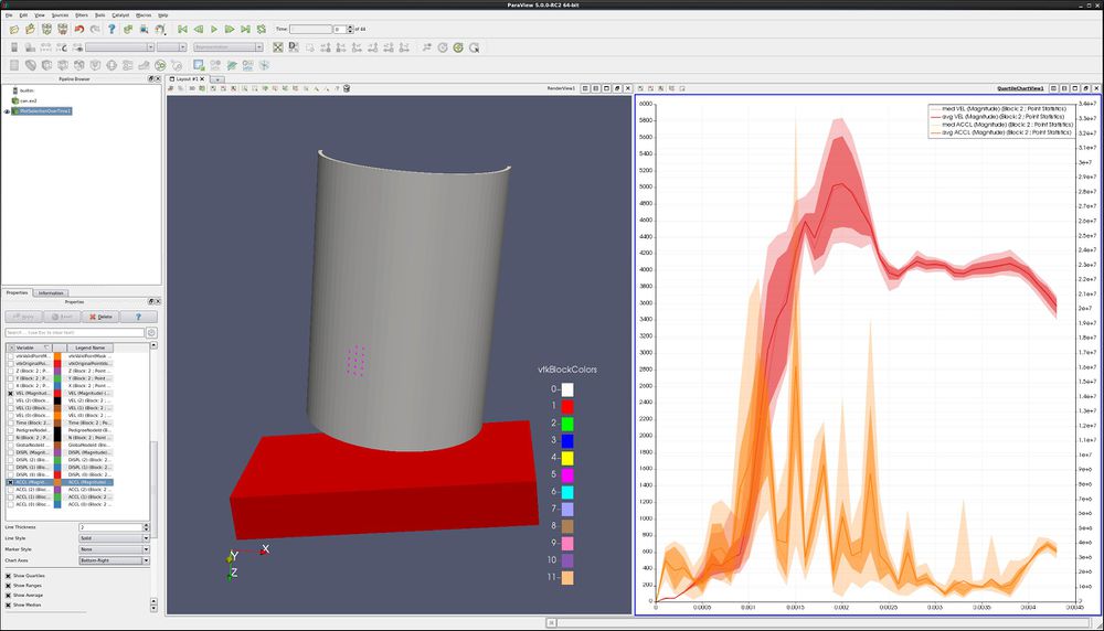
- Click on Select Points On icon. Then, rubber band select a dozen points.
- Filters→Data Analysis→Plot Point Over Time. Apply.
- On the Properties tab, turn off DISPL (Magnitude) and turn on variables VEL (Magnitude) and ACCL (Magnitude).
- Select the line that says ACCL (Magnitude), causing this row to turn gray.
- At the bottom of the Display tab, change Chart Axes to Bottom-Right.
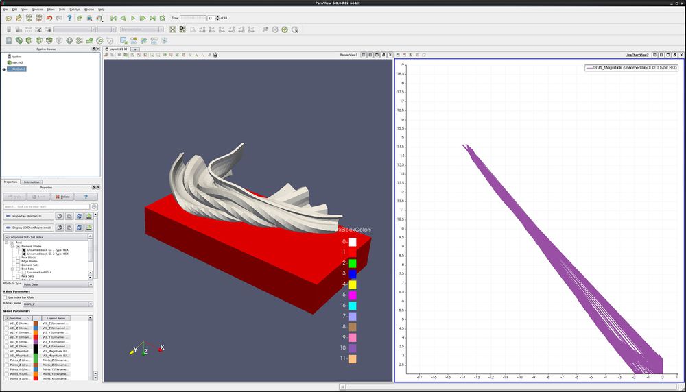
Plot data
- Edit → Reset Session.
- Open can.exo. Turn on all data. Apply.
- Drag the can around with the left mouse button until you can see the can.
- We want to plot two variables against each other, for all points (or cells) of the can.
- Filters→Data Analysis→Plot Data. Apply.
- On the Properties tab, turn off Use Index for X Array and for X Array Name select DISPL_Z
- In Series Paramaters, turn off everything except DISPL (Magnitude)
- Play
Acknowledgements
Sandia is a multiprogram laboratory operated by Sandia Corporation, a Lockheed Martin Company, for the United States Department of Energy’s National Nuclear Security Administration under contract DE-AC04-94AL85000.
