Beginning Plotting: Difference between revisions
From KitwarePublic
Jump to navigationJump to search
No edit summary |
|||
| (11 intermediate revisions by the same user not shown) | |||
| Line 5: | Line 5: | ||
*Open can.exo. Turn on all data. '''Apply'''. | *Open can.exo. Turn on all data. '''Apply'''. | ||
*Drag the can around with the left mouse button until you can see the can. | *Drag the can around with the left mouse button until you can see the can. | ||
*'''Filter→Data Analysis→Plot Over Line'''. Drag the top of the line to intersect the top of the can. Note that hitting the p key will also place the line on the surface of your object. '''Apply'''. | *'''Filter→Data Analysis→Plot Over Line'''. Drag the top of the line to intersect the top of the can. Note that hitting the p key will also place the line on the surface of your object. You can also use the '''1''' and '''2''' keys to set the beginning and end of the line. '''Apply'''. | ||
* | *Properties tab. Unselect all variables except '''DISPL''':Magnitude. | ||
* | *Lower on the Properties tab, find '''Left Axis Use Custom Range'''. Select this, and enter '''0.0''' and '''20.0'''. | ||
* | *Find '''Bottom Axis Use Custom Range'''. Select this, and enter '''0.0''' and '''20.0'''. | ||
*'''Play''' the animation forward, and notice what happens to the plot. | *'''Play''' the animation forward, and notice what happens to the plot. | ||
*You can also add plot labels and axis labels on the properties tab. | |||
[[Image:beginning_plotting_1.png|800px]] | [[Image:beginning_plotting_1.png|800px]] | ||
==Plot point over time== | ==Plot point over time== | ||
*Edit → Reset Session. | |||
*Open can.exo. Turn on all data. '''Apply'''. | *Open can.exo. Turn on all data. '''Apply'''. | ||
*Drag the can around with the left mouse button until you can see the can. | *Drag the can around with the left mouse button until you can see the can. | ||
*We want to plot a point over time. First, we need to select a point. | *We want to plot a point over time. First, we need to select a point. | ||
*Click on '''Select Points On''' icon. Then, click on a point on the can. | |||
*Click on '''Select Points On''' icon. Then, | |||
*'''Filters→Data Analysis→Plot Point Over Time'''. Apply. | *'''Filters→Data Analysis→Plot Point Over Time'''. Apply. | ||
*'''Display''' tab, unselect ''' | *'''Display''' tab, unselect everything other than '''DISPL (Magnitude)''' | ||
*You now have a plot of the displacement. at your point. | *You now have a plot of the displacement. at your point. | ||
*Extra Credit – Using '''Select Cells On''' icon, and the '''Plot Cell Over Time''', plot '''EQPS''' over time. | *Extra Credit – Using '''Select Cells On''' icon, and the '''Plot Cell Over Time''', plot '''EQPS''' over time. | ||
| Line 31: | Line 31: | ||
==Plot two variables at same time== | ==Plot two variables at same time== | ||
*Follow the steps for '''Plot Point over time''', as described above. | *Follow the steps for '''Plot Point over time''', as described above. | ||
*On the | *On the Properties tab, turn off '''DISPL (Magnitude)''' and turn on variables '''VEL (Magnitude)''' and '''ACCL (Magnitude)'''. | ||
*Select the line that says ACCL (Magnitude), causing this row to turn gray. | *Select the line that says '''ACCL (Magnitude)''', causing this row to turn gray. | ||
*At the bottom of the Display tab, change '''Chart Axes''' to '''Bottom-Right'''. | *At the bottom of the Display tab, change '''Chart Axes''' to '''Bottom-Right'''. | ||
*Note below that the ACCL (Magnitude) color has been changed to blue. | |||
[[Image:beginning_plotting_3.png|800px]] | |||
==Plot multiple points (statistics plot version)== | |||
*'''Edit''' → '''Reset Session'''. | |||
*Open can.exo. Turn on all data. '''Apply'''. | |||
*Drag the can around with the left mouse button until you can see the can. | |||
*We want to plot numerous points over time. First, we need to select the points. | |||
*Click on '''Select Points On''' icon. Then, rubber band select a dozen points. | |||
*'''Filters→Data Analysis→Plot Selection Over Time'''. Apply. | |||
*On the Properties tab, turn off all varialbes, and then turn on variables '''VEL (Magnitude)''' and '''ACCL (Magnitude)'''. | |||
*Select the line that says '''ACCL (Magnitude)''', causing this row to turn gray. | |||
*At the bottom of the Display tab, change '''Chart Axes''' to '''Bottom-Right'''. | |||
[[Image:beginning_plotting_4.png|800px]] | |||
==Plot multiple points (spaghetti plot version)== | |||
*'''Edit''' → '''Reset Session'''. | |||
*Open can.exo. Turn on all data. '''Apply'''. | |||
*Drag the can around with the left mouse button until you can see the can. | |||
*We want to plot numerous points over time. First, we need to select the points. | |||
*Click on '''Select Points On''' icon. Then, rubber band select about four points. | |||
*'''Filters→Data Analysis→Plot Selection Over Time'''. Apply. | |||
*On the Properties tab, unselect the '''Only Report Selection Statistics''' checkbox. Apply. | |||
*On the Properties tab, display section, click on '''Root''', turning on all of the points or cells. | |||
*On the Properties tab, turn off everything, then turn on all variables '''VEL (Magnitude)'''. | |||
[[Image:beginning_plotting_4b.png|800px]] | |||
==Plot min, max and average for all points of a block over time== | |||
*'''Edit''' → '''Reset Session'''. | |||
*Open can.exo. Turn on all data. '''Apply'''. | |||
*Drag the can around with the left mouse button until you can see the can. | |||
*We want to plot all of the can points over time. First, we need to select the points. | |||
*Click on '''Select Block''' icon. Select the can. | |||
*'''Filters→Data Analysis→Extract Selection'''. Apply. | |||
*We now have the can. | |||
*'''Find Data dialog'''. This can be found on the '''Edit''' menu. | |||
*Find '''Points''' from '''ExtractSelection#'''. | |||
*Next line, use '''ID''' and '''is >=''' and '''0'''. | |||
*'''Run Selection Query'''/ | |||
*'''Plot Selection Over Time'''. Apply. | |||
*In Series Paramaters, turn off everything except '''DISPL (Magnitude)''' | |||
[[Image:beginning_plotting_6.png|800px]] | |||
==Plot data== | |||
*'''Edit''' → '''Reset Session'''. | |||
*Open can.exo. Turn on all data. '''Apply'''. | |||
*Drag the can around with the left mouse button until you can see the can. | |||
*We want to plot two variables against each other, for all points (or cells) of the can. | |||
*'''Filters→Data Analysis→Plot Data'''. Apply. | |||
*On the Properties tab, turn off '''Use Index for X Array''' and for X Array Name select '''DISPL_Z''' | |||
*In Series Paramaters, turn off everything except '''DISPL (Magnitude)''' | |||
*Play | |||
[[Image:beginning_plotting_5.png|800px]] | |||
=Acknowledgements= | =Acknowledgements= | ||
Sandia is a | Sandia National Laboratories is a multi-mission laboratory managed and operated by National Technology and Engineering Solutions of Sandia, LLC., a wholly owned subsidiary of Honeywell International, Inc., for the U.S. Department of Energy’s National Nuclear Security Administration under contract DE-NA-0003525. | ||
Latest revision as of 20:30, 22 June 2017
Introduction
This use case shows a user how to plot cell and point data. Plotting can be along a line that cuts through your data, or a location with respect to time.
Plot along a line
- Open can.exo. Turn on all data. Apply.
- Drag the can around with the left mouse button until you can see the can.
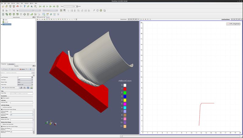
- Filter→Data Analysis→Plot Over Line. Drag the top of the line to intersect the top of the can. Note that hitting the p key will also place the line on the surface of your object. You can also use the 1 and 2 keys to set the beginning and end of the line. Apply.
- Properties tab. Unselect all variables except DISPL:Magnitude.
- Lower on the Properties tab, find Left Axis Use Custom Range. Select this, and enter 0.0 and 20.0.
- Find Bottom Axis Use Custom Range. Select this, and enter 0.0 and 20.0.
- Play the animation forward, and notice what happens to the plot.
- You can also add plot labels and axis labels on the properties tab.
Plot point over time
- Edit → Reset Session.
- Open can.exo. Turn on all data. Apply.
- Drag the can around with the left mouse button until you can see the can.
- We want to plot a point over time. First, we need to select a point.
- Click on Select Points On icon. Then, click on a point on the can.
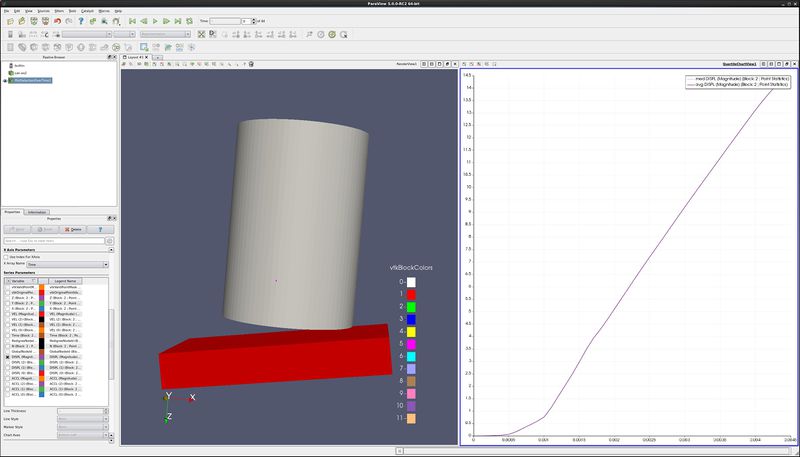
- Filters→Data Analysis→Plot Point Over Time. Apply.
- Display tab, unselect everything other than DISPL (Magnitude)
- You now have a plot of the displacement. at your point.
- Extra Credit – Using Select Cells On icon, and the Plot Cell Over Time, plot EQPS over time.
Plot two variables at same time
- Follow the steps for Plot Point over time, as described above.
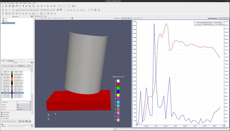
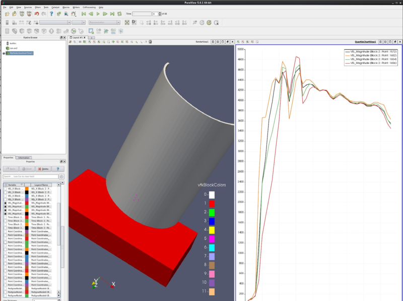
- On the Properties tab, turn off DISPL (Magnitude) and turn on variables VEL (Magnitude) and ACCL (Magnitude).
- Select the line that says ACCL (Magnitude), causing this row to turn gray.
- At the bottom of the Display tab, change Chart Axes to Bottom-Right.
- Note below that the ACCL (Magnitude) color has been changed to blue.
Plot multiple points (statistics plot version)
- Edit → Reset Session.
- Open can.exo. Turn on all data. Apply.
- Drag the can around with the left mouse button until you can see the can.
- We want to plot numerous points over time. First, we need to select the points.
- Click on Select Points On icon. Then, rubber band select a dozen points.
- Filters→Data Analysis→Plot Selection Over Time. Apply.
- On the Properties tab, turn off all varialbes, and then turn on variables VEL (Magnitude) and ACCL (Magnitude).
- Select the line that says ACCL (Magnitude), causing this row to turn gray.
- At the bottom of the Display tab, change Chart Axes to Bottom-Right.
Plot multiple points (spaghetti plot version)
- Edit → Reset Session.
- Open can.exo. Turn on all data. Apply.
- Drag the can around with the left mouse button until you can see the can.
- We want to plot numerous points over time. First, we need to select the points.
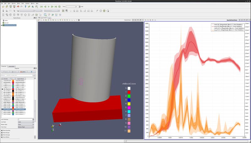
- Click on Select Points On icon. Then, rubber band select about four points.
- Filters→Data Analysis→Plot Selection Over Time. Apply.
- On the Properties tab, unselect the Only Report Selection Statistics checkbox. Apply.
- On the Properties tab, display section, click on Root, turning on all of the points or cells.
- On the Properties tab, turn off everything, then turn on all variables VEL (Magnitude).
Plot min, max and average for all points of a block over time
- Edit → Reset Session.
- Open can.exo. Turn on all data. Apply.
- Drag the can around with the left mouse button until you can see the can.
- We want to plot all of the can points over time. First, we need to select the points.
- Click on Select Block icon. Select the can.
- Filters→Data Analysis→Extract Selection. Apply.
- We now have the can.
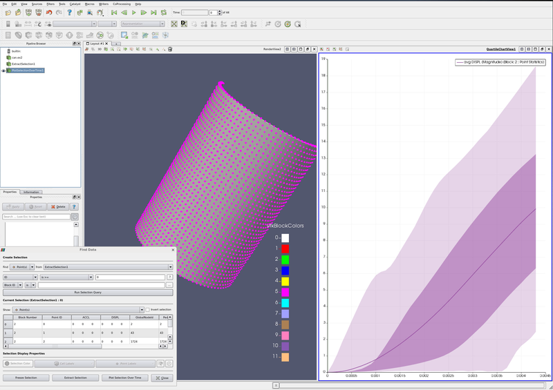
- Find Data dialog. This can be found on the Edit menu.
- Find Points from ExtractSelection#.
- Next line, use ID and is >= and 0.
- Run Selection Query/
- Plot Selection Over Time. Apply.
- In Series Paramaters, turn off everything except DISPL (Magnitude)
Plot data
- Edit → Reset Session.
- Open can.exo. Turn on all data. Apply.
- Drag the can around with the left mouse button until you can see the can.
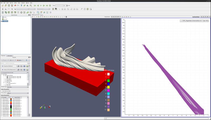
- We want to plot two variables against each other, for all points (or cells) of the can.
- Filters→Data Analysis→Plot Data. Apply.
- On the Properties tab, turn off Use Index for X Array and for X Array Name select DISPL_Z
- In Series Paramaters, turn off everything except DISPL (Magnitude)
- Play
Acknowledgements
Sandia National Laboratories is a multi-mission laboratory managed and operated by National Technology and Engineering Solutions of Sandia, LLC., a wholly owned subsidiary of Honeywell International, Inc., for the U.S. Department of Energy’s National Nuclear Security Administration under contract DE-NA-0003525.
